
In the Summer of 2021, the average MLB batting average was at an all time low of .236. Feeling pressure to ‘spice things up a bit,’ MLB began what has been called a ‘crackdown’ on sticky substances used by pitchers.
These substances such as Spider Tack gave pitchers a literally superhuman ability to grip a baseball, inducing incredible amounts of spin on pitches thrown and, consequently, increased movement on their pitches. To quote SI on the matter:
The use of Spider Tack and such gooey grip aids had grown so ridiculous that players could hear pitches ripping off the sticky fingers of pitchers, like Velcro.
https://www.si.com/mlb/2023/05/12/mlb-crackdown-on-pitchers-sticky-substances-making-the-game-fairer#:~:text=236%2C%20the%20league%20announced%20a,fingers%20of%20pitchers%2C%20like%20Velcro.
Now… there is far more to the story than just this. There were, and are, many opinions on MLB’s decision to do this, but that is beside the point.
As a matter of curiosity, I set out create a tool that would allow me (or anyone) to visually examine data that might be an indication of whether or not a pitcher was using the sticky stuff at the time of the crackdown. To do this, it looks at key statcast metrics, including spin rate and velocity, around the June 1 ban. My hypothesis is that pitch data for pitchers who did use the sticky stuff would be markedly different when comparing pre-ban and post-ban subsets.
The results are pretty cool, to say the least.
Before we get into the interesting stuff, let’s look at two awesome python libraries I used to make this happen….

pybaseball
pybaseball is a Python package for baseball data analysis. This package scrapes Baseball Reference, Baseball Savant, and FanGraphs so you don’t have to. The package retrieves statcast data, pitching stats, batting stats, division standings/team records, awards data, and more. Data is available at the individual pitch level, as well as aggregated at the season level and over custom time periods. See the docs for a comprehensive list of data acquisition functions.
Install it the usual way via pip.
In my code, I pull two distinct data sets: pitch by pitch data for all pre-ban pitches thrown (i.e. before June 1, 2021) and all post-ban pitches thrown, or those thrown after June 1.
Each of these datasets is saved in the location of the .py file so that you do not need to re-download them whenever you want to run the code. Here’s how it happens… (note: I assume a working knowledge of pandas, which i insist is pronounced like the bear and not pon-DOS)
    try:
        pre_load = pd.read_csv('pre_ban_data.csv')
    except FileNotFoundError:
        print("\nPre-ban data file was not found. Loading now... Please be patient.")
        pre_load = pyb.statcast(start_dt="2021-04-01", end_dt="2021-06-11")
        print("\nSaving pre-ban data to csv...")
        pre_load.to_csv('pre_ban_data.csv')

    try:
        post_load = pd.read_csv('post_ban_data.csv')
    except FileNotFoundError:
        print("\nPost-ban data file was not found. Loading now... Please be patient.")
        post_load = pyb.statcast(start_dt="2021-06-11", end_dt="2021-10-03")
        print("\nSaving post-ban data to csv...")
        post_load.to_csv('post_ban_data.csv')

    finally:
        return pre_load, post_load
This section of code checks for the existence of the archived downloads and downloads them if they are not there. It returns two dataframes, pre-ban data and post-ban data.
Each of these dataframes is comprised of a ton of columns which you’ll have to research on your own to find. We care about pitcher name, pitch type, pitch movement, spin rate, and velocity, as well as some location data. It also contains a TON of cool hitter-related data!
Here’s a little sample with some summary stats:
       release_speed  release_spin_rate      spin_axis          pfx_x  \
count  272189.000000      272189.000000  272189.000000  272189.000000
mean       88.823912        2275.859656     175.302951      -0.119085
std         5.997288         342.054212      71.114300       0.878124
min        35.700000          43.000000       0.000000      -2.470000
25%        84.600000        2102.000000     134.000000      -0.860000
50%        89.800000        2297.000000     198.000000      -0.180000
75%        93.600000        2480.000000     220.000000       0.580000
max       103.200000        3722.000000
Neat, eh!?
Next, we ask for the user to input a player name. We do some validation, filter our data based on player name, do some prep work on column names, etc., then we are ready to jump into bokeh!
bokeh
Bokeh is a Python interactive visualization library that is designed for creating expressive and interactive web-based visualizations. Developed by the Bokeh Development Team, Bokeh enables users to generate dynamic and aesthetically appealing plots, charts, and dashboards for data analysis and presentation. It supports various output formats, including HTML, making it convenient for web-based applications. Bokeh emphasizes interactivity, allowing users to create responsive visualizations with tools such as pan, zoom, and hover. The library is particularly useful for creating data visualizations in fields like data science, scientific research, and analytics, where conveying complex information in an accessible and interactive manner is essential.
As we move forward, please keep in mind that I am very much a novice bokeh practitioner. It is a REALLY cool open source tool with a decent learning curve but tremendous capabilities in the field of data visualization.
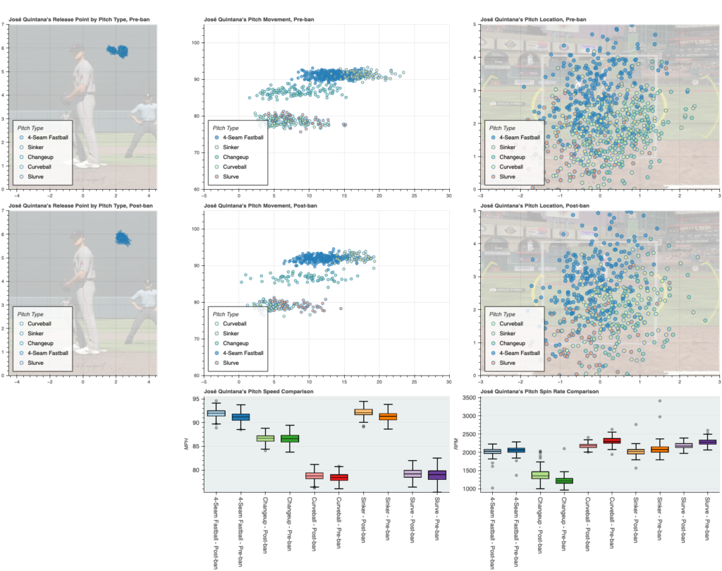
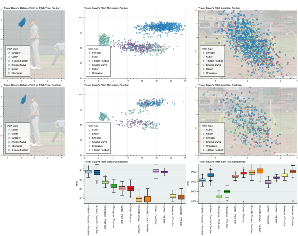
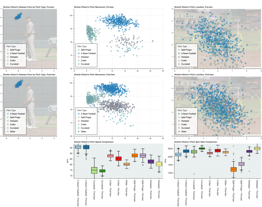
I wanted to examine a few key data points:
- pitch movement
- spin rate
- release point
- velocity
To this end, I made some creative scatter plots. Using well-positioned and scaled images from a know baseball simulation, I was able to provide visual perspective and reference points for the strike zone and release points. Movement is shown on a basic x/y axis. Spin rate and velo comparisons are shown on side-by-side box and whisker plots.
I want to look at some results and some of the inferences they might lead me to…
Let’s look at three intriguing plots:
- Jose Quintana, A very good soft-tosser for the Mets
- Trevor Bauer, who according to my models, had the BEST and LEAST LIKELY good season in 2020, and,
- Shohei Ohtani, baseball’s
$700m$460m man.
First! Sorry for some minor quality of life issues. This is a 97% solution, not 100%.
Second! I am not accusing anyone of anything. I’m just checking out the data in a neat way. MLB is already monitoring this (see the SI link above for more info).
Third! Pay particular attention to the box plots for spin rate. Draw your own conclusions… outside of this one: looks like Quintana altered his delivery during the first months of the year, seen in the change in release point. Seems to have worked for him thus far.
If it is interesting to you, I also used an earlier iteration of this as my final project of Harvard’s CS50 Python course (highly recommended). Here is my video from that course:
Alright, that is all I have! Hope this was useful to you. This is merely the tip of the iceberg when it comes to neat things you can do with bokeh and pybaseball (or any data, really).
Comment a pitcher and I will post a grid for them 🙂


0 Comments